Wednesday, October 11, 2017

9 Photograms

Photogram
Jocelyn Carlin
Photograms

The technique of creating photographic prints without using a camera (photograms) is as old as photography itself – but emerged again in the early 1920s.


Artist Man Ray refined and personalized the technique to such an extent that the new prints eventually carried his name ‘Rayographs’.

Ray-o-gram by Man Ray

How to Make a Photogram
  • Start in a darkroom.
  • Arrange objects onto a light sensitive surface (photo paper). 
  • Once happy with your composition, you are ready to expose. 
  • Set your enlarger timer to 3-15 seconds (Maybe try a test first)
  • Expose your photogram
  • Then develop your Photogram in developer (1-2 mins), stop (30 secs), fix (5 mins), and wash (15 mins).
  • Put on drying rack (careful not to overlap with other prints).


9 Lumen Printing

Lumen prints are made by taking sheets of unexposed black-and-white photo paper and placing objects or negatives on top as if you were going to make a photogram, but instead of using an enlarger you take the paper out into the sun. 

Results will vary due to exposure times, density of photogram or negative, quality of light and, most importantly, the type of paper. Each paper will have a different color, depending on whether it was old or new, fiber or resin, and the manufacturer. 

Lumin Materials
  • Black and white photo paper, preferably out-of-date paper (or film)
  • Photogram materials solid shapes or organic things like plants semi-translucent.
  • A strong base: panel board with glass and clips
  • The Sun/Natural Light

Darkroom set up:
  • Fix
  • Water wash

The process
  1. Select lumen materials. Consider a composition to create with your objects (semi-transparent objects are really effective: flowers, leaves, fruit).
  2. Place photo paper onto a sold base/board then arrange your lumen materials on the photo paper.
  3. If your materials are flat enough, and might shift, then place glass on top of your lumen arrangement, clip to the boards.
  4. Take your lumen composition outside to expose in sunlight. The exposure time depends on you – some people expose for 30 minutes, others as long as a few hours and still others for several weeks. It all depends on the strength of the sun, time of year, location, humidity and how you want your image to look. 
  5. Check the exposure time. You can see the difference if you lift the objects a little without moving them. You should see a tonal difference between the exposed paper and underneath the object.
  6. After your exposure, bring your lumen print back into the darkroom.
  7. Do not develop! 
  8. Fix the print using diluted fix for 5 mins.
  9. Wash your print for 5 minutes. [Fibre based paper 30-40 mins].

Thursday, September 28, 2017

10- Composing an Object

Bring one object with some personality and try to have your item tell a story by placing it thoughtfully into a descriptive background. A story could also emerge based on the relationship to other objects and the space that they are in, distance etc. Experiment with placement, angles, distances to subject, framing etc. Try using BW film.

Black and White Film:
- Photograph your object with a variety of backgrounds.
- Bracket each photo 3x each photo, so you will have 3 photos of each of the set-ups.
- Develop the film.
- Make a contact sheet of your roll of film.
- 3 prints, each 3.5 x 5 showing the essence of your project and contrast filters (0, 90, 150).
- 1 final best print 5 x 7.

Each print will evaluated on the following:
- Composition.
- Creativity.
- Technical- focus, development, contrast
- Professionalism: no scratches, even borders, good contrast, image focused.

Self Evaluation: Based on the criteria, give yourself a mark out of 5 for how well you think you did (good quality negatives, professional prints, broken rules you tried, questions answered, images scanned and on blog).

Questions: Why did you choose this object ? How did you give it character/story?

9 Photographic Composition

Photographic Composition is way of organizing the visual information in an image.
3 things to consider when composing a photograph:
  1. Subject- The most important part of a photograph is the subject. The subject or theme is "what the photo is about". It is the main topic. First choose your subject.
  2. Emphasis- There are techniques that direct your viewer to the subject so the subject stands out and is more clear to the audience. 
  3.  Simplicity- Make sure that all of the information in the photo (background/foreground) supports the subject.
Emphasis Techniques: Try one technique per photograph.
  • Leading lines
  • Rule of 3rds
  • Repetition
  • Framing
  • Contrast
Blog Assignment: Find one example for each of the 5 Emphasis Techniques (can be your own) post to your blog and identify the technique (title) and define the technique and how it draws the attention to the subject (in your own words) one image per definition.

Photo Assignment: We are going to go out and shoot each emphasis technique separately. I may take a few days (it might take after school/weekend days to finish all five techniques). Make a contact sheet for each technique and post your best image to your blog with an explanation of how the image is a good example of the technique. Take approximately 15-30 photos for each technique. Make a contact sheet and post one of each technique.

BWPhoto Assignment: We are going to go try one of the emphasis techniques on BW film.

Here are some photos to show Emphasis Techniques:
Leading Lines

Rule of Thirds

Framing

Contrast

Repetition

Monday, September 11, 2017

Elements of Design: LINE

A line is:
  • A mark that is longer than it is wide
  • An infinite number of points
  • The moving path of a point
Line is often referred to as “the most basic element of design”. Yet this simple element functions in complex ways. Used effectively, line expresses a variety of verbal and visual concepts. Line works either by itself or in conjunction with other lines to communicate messages and impact audience.

A line can have different qualities - it can be curved or straight, thin or thick, loose or precise, delicate or bold, expressive or controlled. The qualities of a line will evoke different feelings; a curved line feels natural and organic, while a straight line feels manmade and mechanical. A delicate line feels soft and feminine, while a bold line feels strong and masculine.

A horizontal line reminds us of a calm horizon or a person lying down; it implies quiet and rest. A vertical line makes us think of a skyscraper or a person standing straight and tall; it feels strong and aspiring. A vertical line contains potential for activity, and so creates a more energetic feeling than a horizontal line. A diagonal line is like a bolt of lightening or a person leaning forward poised to run; it suggests energy and movement. Diagonal lines are the most dynamic.

Not all lines are actual lines; sometimes we perceive lines that are not really there. Implied lines are created by a series of points, such as a dotted line or a group of people standing in a row. Psychic lines are not real at all, but are lines we feel; for example when a figure’s eyes are looking in a specific direction or when a line or shape is pointing at something.

Exercise #1 Line
Line Assignment:
Take 15+ digital photographs of the Element of Design- LINE. Look for all sorts of different types of line, straight, wiggly, craggy, weaving, diagonal, organic, geometric...
Download, edit and evaluate, save best to sharing folder.
Upload your best photo to your personal blog with definition of line and an explanation as why this image is a good example of line.
Create a contact sheet of 15-30(max) images to show your process. Save as a JPG and upload to your blog.
Examples and Characteristics of Lines

Thursday, April 20, 2017

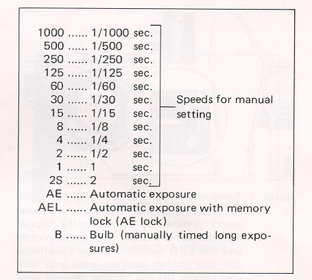
9- Shutter Definitions

Define:
  1. Shutter-
  2. Shutter Speeds (write out the speeds and explain what they mean)-
  3. Shutter Priority-
  4. Exposure & how to set your camera for a good exposure-
  5. Bulb-
  6. Cable Release-
  7. Tripod-
  8. Light Meter-
  9. Bracketing-
  10. Exposure Compensation-
Here is a link to some hints- please respond in your own words
http://www.mir.com.my/rb/photography/glossary/terms_b.htm

Find image examples of the following for your blog, describe the movement rendered in the images and try to identify the shutter speed that was used to take the photo:
Slow Shutter Speed,
Fast Shutter Speed,
Panning,
Painting with Light,
Multiple Exposures/Experiment

Wednesday, April 12, 2017

Term 1 Personal Progress Report

Write a brief reflection of your progress this term:
Check your "term progress report" that I posted as a draft to your blog.
  1. Reflect how you are doing so far. Is your mark fair? What mark do you want?
  2. What can you do to improve?
  3. What assignment(s) did you like most?
  4. What assignment(s) did you like least?
  5. What things do you want to learn next term?


Friday, April 7, 2017

Semester 2 Term 1 Check List

Photo9
  • Favourite Photo
  • Lines- contact sheet, best photo and definition
  • Texture- contact sheet, best photo and definition 
  • Camera Care
  • Camera Modes
  • Composition devices- examples and definitions
  • Composition - contact sheet, best photo and explanation (Post 3+ of the following assignments for reporting period)
                        Leading Lines
                        Framing
                        Rule of thirds
                        Repetition
                        Contrast
                        Levitation
Photo 10

  • Favourite Photo
  • Horizon Lines- contact sheet, best photo and definition
  • Camera Care/ Advanced Camera Modes
  • White Balance- contact sheet, + combined photo
  • Depth of Field Vocabulary and examples
  • Depth of Field-  contact sheet, + 3 best photo of short, medium, long 
  • Levitation

Thursday, March 30, 2017

Levitation


Levitation images are magical! They draw the viewer in and make them think about what’s not quite right. However, levitation photography hasn’t become wildly popular yet. I assume it’s because levitation photography looks really difficult. I think most people would be surprised to learn that in its most basic form, it’s just combining two or more images in editing software.

Tip #1 – Gather Your Equipment

In order to create a levitation photograph, you must have: a camera (that has manual focus capabilities), a tripod, a willing model, and something to prop your model up (a stool, chair, or ladder). Optional items: a strong fan (if your model has medium to long hair), and a camera remote.

Tip #2 – Tell Your Model What to Wear

Clothing can make or break a levitation image.

  • Solid color clothing is best. Prints and patterns can make it difficult if you need to clone out certain parts of clothing or liquefy fabric.
  • Tell your model not to wear a jacket or sweater. Anytime the model lays upside-down, or sideways, the garment should be hanging down. But if he/she is laying on a stool, the jacket won’t be able to naturally hang leaving the image looking less realistic.
  • If you’re going for a feminine levitation shot, long dresses, skirts, or extra flowing fabric can help create the look you’re going for.

Tip #3 – Shoot on a Cloudy Day

Sun and harsh shadows have the potential to create a lot of extra work for you in post-production. Editing out the stools and ladders, yet keeping a realistic shadow of your subject can turn into a job for Photoshop experts.

Tip #4 – Shoot from a Low Angle

You will want to shoot from a low perspective to give the illusion that your subject is high in the air. However, be mindful of how low you are. If you are lower than the prop your model is standing/laying on, the prop will block parts of his/her body. It is safest to shoot in line with the top of the prop your model is on. Having your model situated at the very front of the prop will also lessen the chance of cutting into the body.

Tip #5 – Always Photograph the Empty Background

When preparing to photograph the frames that will create your final levitation image, follow these steps.
  1. Set up your shot with your model in the frame.
  2. Plan the angle you are going to shoot from and set up your camera on the tripod.
  3. When your model is in place, choose the focus point on your subject.
  4. Set your camera to manual focus and don’t touch it!
  5. Take the different shots suggested below, in Tip #6, without moving your focus point or your camera.
  6. After you’re sure you’ve captured all the images you need with your model and props, remove EVERYTHING from the scene. Photograph ONLY the empty background. This is the most important image you will take.

Tip #6 – Take Multiple Shots to Create One Image

The most basic levitation image is a composition of two or more frames. At the bare minimum, you will need at least a shot of the background and one of the model in that background.
Most great levitation images use a few more frames to add interest and make the final image more provoking. Here is a list of some shots you might want to take all without changing the focus and position of the camera:
  1. Model on the prop(s) – the focus of this shot is on what the arms, legs, and body are doing.
  2. Hair and facial expression – the focus of this shot is to capture the models expression and hair moving like it would naturally if the model was really in that position (floating straight up, blowing behind her, etc.). *Hair dryers and small fans are not strong enough to propel hair in specific directions. The longer and heavier the hair, the more powerful the fan needs to be.
  3. Clothing – the focus of this shot is to capture the movement of the clothing (if needed). If your model is being pulled one direction, what direction should the loose fabric be moving?
  4. Additional props – the focus of this shot is to photograph any extra props you want in the picture (if desired).
  5. Empty background – see Tip #5 above to learn more about the importance of this shot.

Tip #7 – Putting the Images Together

Many levitation photographers use Adobe Lightroom and Photoshop to create their final images. Regardless of your software choice, it is recommended to first color correct the series of shots so they are all the same. Lightroom has a great “sync” feature to make sure the exact same settings are applied to the entire series of images.
Next, open the images in an editing software like Photoshop. Start with the empty background image. Next, add in the main image of your model as a layer with a “Reveal All” mask. Simply use a black paintbrush on the mask to remove the props supporting your model. The end of this article describes each step in more detail. Repeat those steps for each frame you’d like to add. Finally, you can merge your layers and put the finishing touches on your final image. Then voila, you have a gorgeous piece of levitation art.

Some Tips, Tricks, Dos, and Don’ts

by Christopher James
Shoot using a wide angle lens
Shoot using a 35mm or lower focal length to create depth in the image and model simultaneously. I messed around with a bunch of focal lengths at first—mostly with an 85mm at first—but I kept running into an issue where the subject felt out of place as if I had just copy pasted them from another photo without connecting them to the scene.
I later realized that this issue was coming from the compression found at longer focal lengths. The compression made everything so flat that my brain couldn’t realistically believe the model and scene were connected at different points of distance, which would sell the effect.
Shooting around 35 or lower brought in enough distortion to make it look like the model wasn’t some 2d object placed over the ground.

Make sure your model physically connects to the scene
Another way to avoid the “copy-paste” look is to make sure your model makes contact with the environment in unique ways. The idea is that if they’re floating up in the sky without any connection to the scene, it looks fake. But by making sure to get a shadow, reflection, hand on the ground, or even some hair falling it lets the viewers brain know “oh yeah, she’s there”
Try to include at least 2 “connections” if you really want to sell the effect.

Get low
The lower your viewing angle, the larger the gap between the subject and the ground. If you’re too high up, it doesn’t matter if there are 2 inches or 2 feet there, it still looks like they’re on the ground. So get low, create that cap and sell the effect.

Weight distribution
This is the big one. I would spend hours tearing my hair out, wondering why some images worked and others wouldn’t. It’s all about where your model is putting their weight.
The thing is, Our eyes expect to have someone sitting on their butt. So if I take a picture of someone sitting and just remove the chair, its gonna look awful because you can imagine the support even when its not there. The trick is to make it impossible to tell where the supports are (if any). This sells the idea of someone actually floating and not just standing or sitting on something.
Put your supports in places that arch normally or aren’t meant to be load bearing parts of your body. (lower back, back of the heels). These are also places where there isn’t much skin or fat to “flatten out” and look like its being molded to something.

Clothing
The key is flowy, see-thru fabric. Lots of misdirection and motion keeps the viewers eye guessing as to how much movement and support actually was there. I like white dresses and skirts.

Lots of supports
You’re gonna want to experiment with supports of different shapes, sizes, and angles. The universal key here is get something with a low profile (think exercise bench). The less you have to take out in post, the easier it is.
If you get something minimal enough you wont even need the 2nd layer in PS, just a little bit of clone stamping.

Body language
This ones is really hard—certainly the most time-consuming part of the process. Turns out it’s really really difficult to make someone look like they’re floating peacefully and not straining at being upside down or balancing on one foot; however, there are a few ways to help this along:


Thursday, March 2, 2017

10- Depth of Field Vocabulary

Define the following, put on your blog:
  1. Depth of Field-
  2. How to Control Depth of Field-
  3. Exposure Triangle-
  4. Aperture/F-stop-
  5. Aperture Priority-
  6. Al Servo/Continuous Focus
  7. Metering-
  8. ASA/ISO/Film Speed-
  9. Histogram-
  10. Bokeh-
You can find some of the definitions here:
Glossary of Photographic Terms
or here
common photography terms  
Find examples for your journal label each image and guess the aperture settings used on the camera:
  1. Short Depth of Field,
  2. Medium Depth of Field,
  3. Long Depth of Field,
  4. Unusal Focusing
  5. Ambient Light

Tuesday, February 21, 2017

10 White Balance Project

White Balance (WB) is the process of removing unrealistic color casts, so that objects which appear white in person are rendered white in your photo. Proper camera white balance has to take into account the "color temperature" of a light source, which refers to the relative warmth or coolness of white light. Our eyes are very good at judging what is white under different light sources, but digital cameras often have great difficulty with auto white balance (AWB) — and can create unsightly blue, orange, or even green color casts. Understanding digital white balance can help you avoid these color casts, thereby improving your photos under a wider range of lighting conditions.


The White Balance Assignment:

Try all of the Auto White Balance settings on your camera while photographing the exact same scenarios. Don't move a hair. Stay in the exact same place only change the WB on your camera (finish with "Custom" WB). Try 3 different set ups in 3 different kinds of lighting i.e. outside/daylight, interior/fluorescent, interior/incandescent. Make a contact sheet of your different experiments 21 + photos (with WBs labelled).

Photoshop Assignment:

Then select your best composition and blend the 7+ white balance test images into one image using Adobe Photoshop (like your Photo of the Year project). Post your blended white balance scenes in your journal/blog and label the white balance settings on your image.

How to Set Custom White Balance:

1) Hold/Place your 18% Grey Card in the desired lighting & take a photo of it. Ensure you cover the entire frame with the Grey card & expose properly(the exposure meter should be balanced in middle i.e. 0 in your viewfinder).


2) Navigate to the second tab(Shooting Tab 2) under MENU on your Canon EOS DSLR. Select ‘Custom White Balance’. It will now open up the saved images on your memory card & prompt you to select one. Select the one of the Grey card you shot in step #1 above. It will ask you to use White Balance data from this image for custom white balance. Select Ok.


3) Now change the White Balance to ‘Custom’ from MENU & proceed to take your photograph. The photograph should have accurate colours.


Handy tips when using Custom White Balance:

* Once you’ve set a custom white balance for a particular light type (tube-light, bulbs etc), there is no need to set the white balance using grey card again. You only need to redo the above procedure if you happen to change the lighting setup. Remember, once you setup your custom white balance in your camera & start shooting, do NOT change the light setup. Or you’ll be plagued with improper white balance.

* It doesn’t matter if you shoot the Grey card shot in RAW or JPEG for setting Custom White Balance.

* While shooting the Grey card, using spot metering is recommended if you’re not able to get close to fill the entire frame with the Grey card.

* If you don’t have a Grey card, you can use almost any neutral grey surface to set the white balance (some use a white sheet of paper, but some white is not true white). If the surface is not totally neutral, you may need to make fine adjustments to your white balance later on computer in-spite of using a custom white balance.

9 Element of Design: TEXTURE

Texture describes a surface while conveying an emotional effect. Light helps one to see and capture texture. Texture can be accentuated by light from the side in early sunny mornings or early evenings, or by overhead light when the sun is vertical and high in the sky. It also depends upon where the photographer places themselves while they are taking capturing the texture.


Texture Assignment:
Take 20-30 digital photographs of the Element of Design- TEXTURE
Download, edit and evaluate, save top three to sharing folder.
Upload your best photo to your personal blog with definition of texture and an explanation as why this image is a good example of texture.

Thursday, February 2, 2017

Favourite Photo

Today we are going to set up student class blogs. Personalize your blog, make it yours.

Then create your first post about your favourite photo. Write a few things about your photo,

  1. Describe your favourite photo
  2. Why is it your favorite? 
  3. What is special about the photo? 

Then share something about your interests, experiences in Photography.What do you want to learn this semester?